
柱状图、堆叠图、直方图
单系列柱状图
多系列柱状图
堆叠图
直方图
import numpy as np
import pandas as pd
import matplotlib.pyplot as plt
%matplotlib inline

# 不发出警告
import warnings
warnings.filterwarnings('ignore')

# 导入notebook绘图模块
from bokeh.io import output_notebook
output_notebook()

# 导入图表绘制、图表展示模块
from  bokeh.plotting import figure,show
from  bokeh.models import ColumnDataSource
单系列柱状图
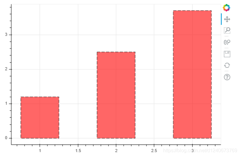
# 绘制竖向柱状图:vbar
p = figure(plot_width=600, plot_height=400)
p.vbar(x=[1,2,3], width=0.5, bottom=0, top=[1.2, 2.5, 3.7],   # x: 横轴坐标,width:宽度,bottom:底高度,top:顶高度
       # color = ['red', 'blue', 'green'] ,  # 单独设置颜色,也可以整体设置
       line_width=1, line_alpha=0.8, line_color='black', line_dash=[8,4],
       fill_color='red', fill_alpha=0.6
      )

show(p)
绘制横向柱状图:hbar
df = pd.DataFrame({'value': np.random.randn(100)*10,
                  'color': np.random.choice(['red', 'blue', 'green'],100)})

p = figure(plot_width=600, plot_height=400)
p.hbar(y=df.index, height=0.5, left=0, right=df['value'],   # y: 纵轴坐标,height:厚度,left:左边最小值,right:右边最大值
       color = df['color'] ,  # 单独设置颜色,也可以整体设置
       fill_alpha=0.6
      )

show(p)
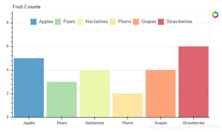
单系列柱状图 - 分类设置标签
from bokeh.palettes import Spectral6
from bokeh.transform import factor_cmap


# 创建一个包含标签的data,对象类型为ColumnDataSource
fruits=['Apples', 'Pears', 'Nectarines', 'Plums', 'Grapes', 'Strawberries']
counts=[5, 3, 4, 2, 4, 6]
source=ColumnDataSource(data=dict(fruits=fruits, counts=counts))
colors=['salmon', 'olive', 'darkred','goldenrod', 'skyblue','orange']

# 绘制柱状图,横轴直接显示标签
p=figure(x_range=fruits, y_range=(0,9), plot_height=350, title='Fruit Counts',tools='')
p.vbar(x='fruits', top='counts', source=source,  # 加载数据的另一种方式
       width=0.9, alpha=0.8,
       color=factor_cmap('fruits', palette=Spectral6, factors=fruits),  # 设置颜色
       legend="fruits"
      )
# factor_cmap(field_name, palette, factors, start=0, end=None, nan_color='gray'):颜色转换模块,生成一个颜色转化对象
# field_name: 分类名称,palette:调色盘,factors:用于在调色盘中分颜色的参数

p.xgrid.grid_line_color=None
p.legend.orientation='horizontal'
p.legend.location='top_center'

show(p)
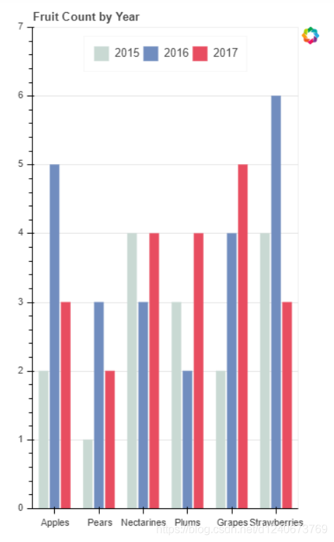
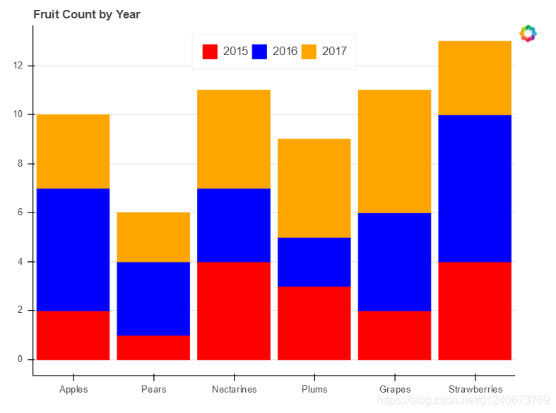
多系列柱状图
from bokeh.transform import dodge
from bokeh.core.properties import value

df=pd.DataFrame({'2015': [2, 1, 4, 3, 2, 4],
                '2016': [5, 3, 3, 2, 4, 6],
                '2017': [3, 2, 4, 4, 5, 3]},
               index = ['Apples', 'Pears', 'Nectarines', 'Plums', 'Grapes', 'Strawberries'])

df.head()

fruits=df.index.tolist()  # 横坐标
years=df.columns.tolist()   # 系列名
data={'index': fruits}

# 生成数据,格式为dict,也可以直接用df
for year in years:
    data[year] = df[year].tolist()

# 将数据转化为ColumnDataSource对象
source=ColumnDataSource(data=data)

p=figure(x_range=fruits, y_range=(0,7), plot_width=350, title="Fruit Count by Year", tools='')

# 绘制多系列柱状图
p.vbar(x=dodge('index', -0.25, range=p.x_range), top='2015', width=0.2, source=source, color='#c9d9d3', legend=value('2015'))
p.vbar(x=dodge('index', 0.0, range=p.x_range), top='2016', width=0.2, source=source, color='#718dbf', legend=value('2016'))
p.vbar(x=dodge('index', 0.25, range=p.x_range), top='2017', width=0.2, source=source, color='#e84d60', legend=value('2017'))
# dodge(field_name, value, range=None)  -> 转换成一个可分组的对象,value为元素的位置
# value(val, transform=None)  -> 按照年份分为dict

p.xgrid.grid_line_color=None
p.legend.orientation='horizontal'
p.legend.location='top_center'

show(p)
堆叠图
from bokeh.core.properties import value

# 创建数据
fruits = ['Apples', 'Pears', 'Nectarines', 'Plums', 'Grapes', 'Strawberries']
years = ['2015', '2016', '2017']
colors=['red', 'blue', 'orange']
data={'fruits': fruits,
        '2015': [2, 1, 4, 3, 2, 4],
         '2016': [5, 3, 3, 2, 4, 6],
         '2017': [3, 2, 4, 4, 5, 3]
}
source=ColumnDataSource(data=data)

# 绘制堆叠图,注意第一个参数需要放years
p=figure(x_range=fruits, plot_height=450, title="Fruit Count by Year", tools='')
renderers=p.vbar_stack(years,  # 设置堆叠值,这里source中包含了不同年份的值,years变量用于识别不同堆叠层
                       x='fruits',  #  设置x坐标
                       source=source,
                       width=0.9, color=colors,
                       legend=[value(x) for x in years],
                       name=years
                      )

p.xgrid.grid_line_color = None
p.axis.minor_tick_line_color=None
p.outline_line_color=None
p.legend.location='top_center'
p.legend.orientation='horizontal'

show(p)
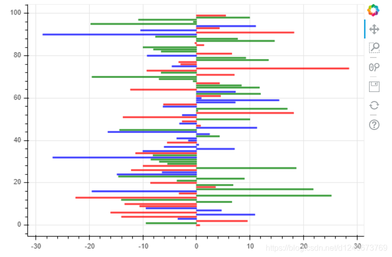
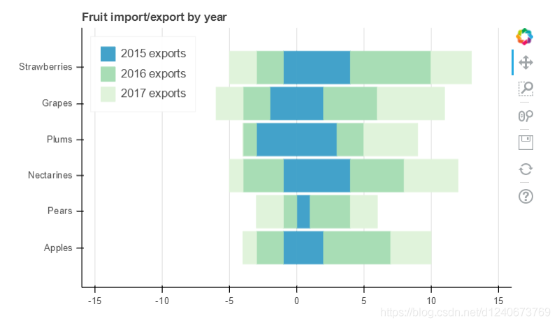
堆叠图 - 横向
# 导入颜色模块
from bokeh.palettes import GnBu3, OrRd3

fruits = ['Apples', 'Pears', 'Nectarines', 'Plums', 'Grapes', 'Strawberries']
years = ['2015', '2016', '2017']

exports={'fruits': fruits,
         '2015': [2,1,4,3,2,4],
         '2016': [5,3,4,2,4,6],
         '2017': [3,2,4,4,5,3]
        }

imports={'fruits': fruits,
         '2015': [-1,0,-1,-3,-2,-1],
         '2016': [-2,-1,-3,-1,-2,-2],
         '2017': [-1,-2,-1,0,-2,-2]
        }

p=figure(y_range=fruits, plot_height=350, x_range=(-16,16), title="Fruit import/export by year")

# 绘制出口数据堆叠图
p.hbar_stack(years, y='fruits', height=0.9, color=GnBu3, source=ColumnDataSource(exports),
             legend=['%s exports' % x for x in years]
            )

# 绘制进口数据堆叠图
p.hbar_stack(years, y='fruits', height=0.9, color=GnBu3, source=ColumnDataSource(imports),
             legend=['%s exports' % x for x in years]
            )

p.y_range.range_padding=0.2   # 调整边界间隔
p.ygrid.grid_line_color=None
p.legend.location='top_left'
p.axis.minor_tick_line_color=None
p.outline_line_color=None

show(p)
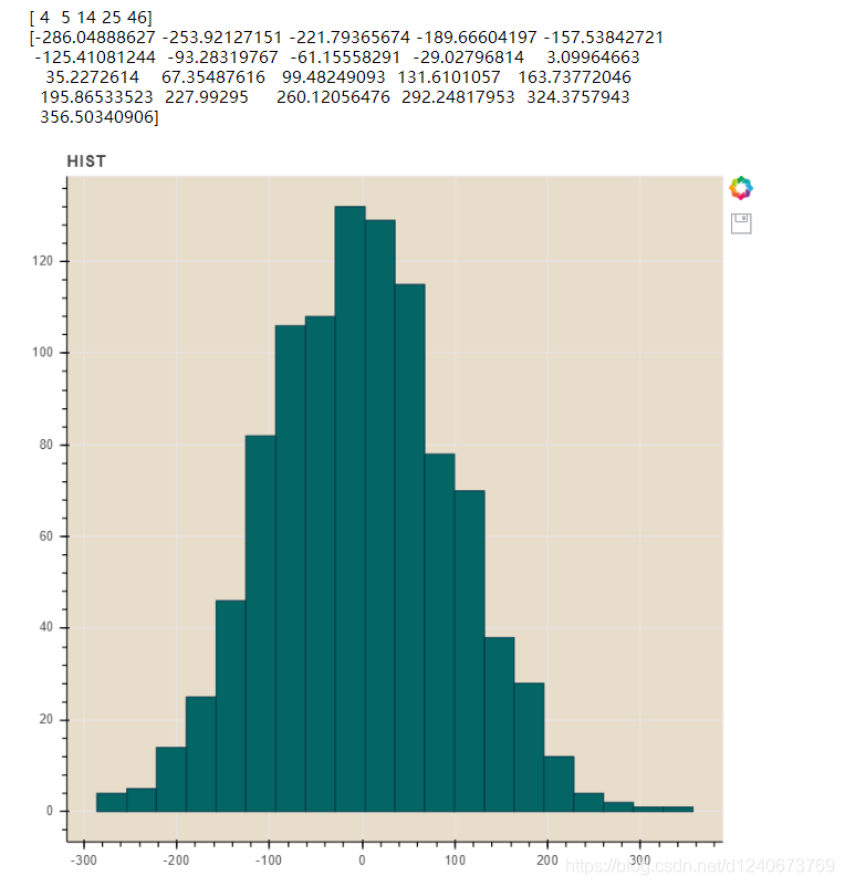
直方图
df = pd.DataFrame({'value': np.random.randn(1000)*100})
df.index.name='index'
df.head()

hist, edges = np.histogram(df['value'],bins=20)
print(hist[:5])
print(edges)
# 将数据解析成直方图统计格式
# 高阶函数 np.histogram(a, bins=10, range=None, weight=None, density=None)
# a:  数据;bins:箱数; range:最大最小值的范围,如果不设定,则为(a.min(), a.max())
# weights:权重;density:为True则返回"频率",为False则返回"计数"
# 返回值1 - hist:每个箱子的统计值(top)
# 返回值2 - edges:每个箱子的位置坐标,这里n个bins将会有n+1个edges

p=figure(title="HIST", tools="save", background_fill_color="#E8DDCB")
p.quad(top=hist, bottom=0, left=edges[:-1],right=edges[1:], # 分别代表每个柱子的四边值
       fill_color="#036564", line_color="#033649"
      )
# figure.quad 绘制直方图

show(p)
————————————————
版权声明:本文为CSDN博主「Jepson2017」的原创文章,遵循CC 4.0 BY-SA版权协议,转载请附上原文出处链接及本声明。
原文链接:
https://blog.csdn.net/d1240673769/article/details/118881720
点击查看更多内容
为 TA 点赞
评论
共同学习,写下你的评论
评论加载中...
作者其他优质文章
正在加载中


感谢您的支持,我会继续努力的~
扫码打赏,你说多少就多少
赞赏金额会直接到老师账户
支付方式
打开微信扫一扫,即可进行扫码打赏哦